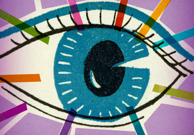
Art-i-Facts: Uncovering the Mysteries of Digital Acronyms
Do you know the difference between CMYK and RGB? Have you wondered what dpi and ppi mean? When to use EPS or PDF? PSD and PNG? As the digital world grows more complex, I’ve found that having a working knowledge key digital design and development language is essential to communicating with your team.
Lets start with “screen resolution.” The PC, laptop and mobile devices you use are measured in “pixels per inch.” Websites, microsites and mobile apps are viewed at 72 dpi resolution.
The word “pixel” originated from the combination of two words: “pix” (picture) + “el” (element) = pixel. A pixel is a physical element that displays a portion of the bitmap image. (An image made of pixels). So, the “standard” ppi of a computer screen is currently 72 pixels per inch. (that’s going to change with Apple’s “Retina” display, which adds another layer of complexity—and is a discussion for another post!)
The abbreviation, “dpi” refers to “dots per inch (dpi),” and originated in the print world. During the printing process, the overlapping of the basic four colors of ink create the illusion of “full color.”
Different types of papers require specific dot densities to accommodate varying degrees of paper absorption in order to recreate a clear illusion of a full-color image.
300 dpi is the industry-standard for high quality print reproduction on glossy stock. 150 dpi is generally the standard for large-format output and 85 dpi is the standard for newsprint. Copying an image from the web for use in print production is problematic because when a 72 dpi image that is intended for screen viewing is enlarged to print quality 300 dpi, there simply is not enough data and the image becomes “pixelated,” or blurry.
As a general rule, it’s best to keep an “original,” high-res image in your files or obtain one from the original source (additional usage costs may apply). A best practice would be to only reduce an image, but not to enlarge it, for the highest quality results.
“CMYK” also originates from the world of print. The four overlapping colors (made up of dots) we talked about earlier, are an acronym for the ink colors, cyan, magenta, yellow and the “K” stands for “key” or black. The CMYK model works by partially or entirely masking colors on a lighter, or white background. The ink reduces the light that would otherwise be reflected off the surface. This model is called subtractive because inks “subtract” brightness from white.”
“RGB” translates to light that is “red, green, blue,” and is defined as an “additive” color model which creates a broad spectrum of hues when the three primary colors are added together in varying intensity. The main purpose of the RGB color model is for the representation and display of images in electronic systems, such as televisions, computer screens and digital photography.
In additive color models such as RGB, white is the “additive” combination of all primary colored lights, while black is the absence of light. In the CMYK model, it is the opposite: white is the natural color of the paper or other background, while black results from a full combination of colored inks.
What marketing & branding/digital design/website development acronyms keep you up at night trying to make sense of them?

Not getting the results you need from your marketing and lead generating campaigns—despite your best efforts?
This guide will help you discover how a powerful design strategy, image enhancements, and selective visual media can unleash the effectiveness of your B2B message.
You might also like

The Moving Target of Color Perception

Beyond the Brand: Your Digital Customer Relationship
Deliver Visual Design Impact With Microsites

Guide to Microsite Best Practices

5 Habits of Highly Effective Outsourced Design Firms
Create an Unusual Logo Design to Deliver Targeted Impact

Books Don’t Sell Themselves! Microsites Help Reel in Readers
Book Microsite in Action

1 Simple Trick for Better Brand Design

7 Ways To Get More Out of Your Outsourced Design Team

Style vs. Design — From the Inside Out

Your Customer Journey Strategy

Research: 67% of Companies Implement Unique Landing Pages

Four Things Iron Man Can Teach Us About Design