The Moving Target of Color Perception
Color perception is a moving target in today’s multi-channel environment. Despite the fact you may have a specific Pantone Matching System (PMS) color in mind, it will inevitably look different in various print and digital design environments.
In a previous post, Art-i-Facts: Uncovering the Mysteries of Digital Acronyms, I discussed the basics of how colors are constructed; today, let’s dig into the implications. PMS colors are really the foundation for any discussion on color matching—although it technically only applies to offset-printed ink on paper.
The good news is, your corporate brochures, letterhead, and business cards are likely under control when it comes to color. But think about this:
- Even if you have a so-called color-correct monitor, it’s unlikely to be an exact match for PMS color chips—and how well it matches will change as the monitor warms up.
- Even if your computer is a good match…what’s the likelihood that someone else in your office or one of your customers is viewing it on a calibrated monitor? (Answer: Approximately 0%.)
- When a piece is printed out on an office ink-jet printer, or played on a large video screen, it’s not going to match much of anything, let alone a specific PMS color!
Now, my goal here isn’t to make you throw up your hands in despair, only to provide a reality check. Color perception is highly subjective and there are limitations and differences in color consistency based on the formats the file is saved in and changed to; the quality of the screen it’s viewed on; the device it’s printed on; or the way it’s output—such as stitching, silk screening, etc. These methods can only approximate standard PMS color chips.
And, another thing to consider is that “neutral” colors, i.e. tans or grey tones, are the most vulnerable to color shifts in any medium because they usually contain all of the basic colors, so even a little more red/magenta quickly warms up a color or a little more blue cools it off in a hurry.
Is there anything you can do to mitigate the issues of color variability in design?
- Pantone offers a number of monitor and printer calibration tools that can serve as a good baseline.
- Keep things simple—the fewer color-dependent variables in a design, the less the target will move…or the less the movement will matter.
- Hold color accuracy to a high standard when it’s possible; but loosen the reins a bit when it’s less controllable.
- Keep the lines of communication open between graphic designer, web designer, and printer or other vendor —and heed their expertise in how colors react in their “native environments.”

Not getting the results you need from your marketing and lead generating campaigns—despite your best efforts?
This guide will help you discover how a powerful design strategy, image enhancements, and selective visual media can unleash the effectiveness of your B2B message.
You might also like
Art-i-Facts: Uncovering the Mysteries of Digital Acronyms

Beyond the Brand: Your Digital Customer Relationship
Deliver Visual Design Impact With Microsites

Guide to Microsite Best Practices

5 Habits of Highly Effective Outsourced Design Firms
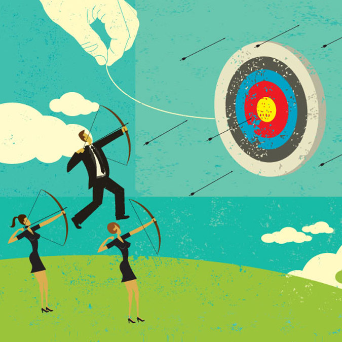
Create an Unusual Logo Design to Deliver Targeted Impact

Books Don’t Sell Themselves! Microsites Help Reel in Readers
Book Microsite in Action

1 Simple Trick for Better Brand Design

7 Ways To Get More Out of Your Outsourced Design Team
Style vs. Design — From the Inside Out
Your Customer Journey Strategy

Research: 67% of Companies Implement Unique Landing Pages

Four Things Iron Man Can Teach Us About Design